---
title: "Stage 1 · Descriptive KPI Analysis"
subtitle: "Network overview · Process funnel · KPI heatmap · Regional distribution"
---
```{r setup}
#| include: false
library(tidyverse)
library(plotly)
library(gt)
library(patchwork)
library(sf)
library(igraph)
library(tidygraph)
library(ggraph)
library(lubridate)
source("../R/utils_viz.R")
source("../R/utils_kpi.R")
claims <- readRDS("../data/claims.rds")
partners <- readRDS("../data/partners.rds")
proc_events <- readRDS("../data/process_events.rds")
```
## Network Overview
### Partner Distribution by Type
```{r partner-type-bar}
#| fig-height: 4
p_type <- partners |>
  count(type) |>
  ggplot(aes(x = reorder(type, n), y = n, fill = type)) +
  geom_col(width = 0.65, show.legend = FALSE) +
  geom_text(aes(label = n), hjust = -0.3, size = 3.5, colour = "#003781", fontface = "bold") +
  scale_fill_manual(values = c(
    Werkstatt     = "#003781",
    Glaspartner   = "#0066CC",
    Gutachter     = "#00A9CE",
    Abschlepp     = "#66B5E8",
    Mietwagen     = "#FF6600"
  )) +
  scale_y_continuous(expand = expansion(mult = c(0, 0.15))) +
  coord_flip() +
  labs(title    = "Partner Count by Type",
       subtitle = "60 partners across 8 Swiss regions",
       x = NULL, y = "Number of Partners") +
  theme_allianz(grid = "y")

ggplotly(p_type, tooltip = c("x", "y")) |>
  layout(hoverlabel = list(bgcolor = "#003781", font = list(color = "white")))
```
### Claims Profile Summary
```{r claims-profile}
#| echo: false
library(gtsummary)
library(gtExtras)
claims |>
select(claim_type, vehicle_class, coverage_type, fault_indicator,
repair_cost, duration_days, csat_score, fraud_flag, steering_flag) |>
mutate(
steering_flag = factor(steering_flag, labels = c("Not steered", "Steered")),
fraud_flag = factor(fraud_flag, labels = c("No fraud", "Fraud suspected"))
) |>
tbl_summary(
by = claim_type,
statistic = list(
all_continuous() ~ "{median} ({p25}–{p75})",
all_categorical() ~ "{n} ({p}%)"
),
label = list(
vehicle_class ~ "Vehicle Class",
coverage_type ~ "Coverage Type",
fault_indicator ~ "Fault",
repair_cost ~ "Repair Cost (CHF)",
duration_days ~ "Duration (days)",
csat_score ~ "CSAT Score",
fraud_flag ~ "Fraud Flag",
steering_flag ~ "Steering"
),
digits = all_continuous() ~ 0
) |>
bold_labels() |>
add_overall() |>
modify_caption("**Claims Dataset Overview** · Median (IQR) or Count (%)") |>
as_gt() |>
tab_style(
style = cell_fill(color = "#003781"),
locations = cells_column_labels()
) |>
tab_style(
style = list(cell_text(color = "white", weight = "bold")),
locations = cells_column_labels()
) |>
tab_options(table.font.size = px(12))
```
### Partner Network Graph
```{r network-graph}
#| fig-height: 6
library(visNetwork)

# Nodes: regions (large circles) + partners (smaller dots by type)
region_nodes <- distinct(partners, region) |>
  transmute(
    id         = region,
    label      = region,
    group      = "Region",
    size       = 28,
    font.size  = 14,
    title      = paste0("<b>", region, "</b>")
  )

type_colors <- c(Werkstatt="#0066CC", Glaspartner="#00A9CE",
                  Gutachter="#66B5E8", Abschlepp="#6B7280", Mietwagen="#FF6600")

partner_nodes <- partners |>
  transmute(
    id        = partner_id,
    label     = partner_id,
    group     = as.character(type),
    size      = 12,
    font.size = 9,
    title     = paste0(
      "<b>", name, "</b><br>",
      "Type: ", type, "<br>",
      "Region: ", region, "<br>",
      "Capacity: ", capacity_class
    )
  )

nodes <- bind_rows(region_nodes, partner_nodes)
edges <- partners |>
  select(from = region, to = partner_id) |>
  mutate(color = "#66B5E8", width = 1)

visNetwork(nodes, edges, width = "100%", height = "520px") |>
  visGroups(groupname = "Region",      color = list(background = "#003781", border = "#002060"),
            font     = list(color = "white", size = 14, bold = TRUE)) |>
  visGroups(groupname = "Werkstatt",   color = list(background = "#0066CC",  border = "#004D99")) |>
  visGroups(groupname = "Glaspartner", color = list(background = "#00A9CE",  border = "#007A99")) |>
  visGroups(groupname = "Gutachter",   color = list(background = "#66B5E8",  border = "#3399CC")) |>
  visGroups(groupname = "Abschlepp",   color = list(background = "#6B7280",  border = "#4A4F5A")) |>
  visGroups(groupname = "Mietwagen",   color = list(background = "#FF6600",  border = "#CC5200")) |>
  visOptions(
    highlightNearest = list(enabled = TRUE, degree = 1, hover = TRUE),
    nodesIdSelection = list(enabled = TRUE, main = "Select a partner…",
                            style = "font-size:13px; padding:4px")
  ) |>
  visPhysics(
    solver           = "forceAtlas2Based",
    forceAtlas2Based = list(gravitationalConstant = -60, springLength = 120),
    stabilization    = list(iterations = 200)
  ) |>
  visLegend(width = 0.15, position = "right", main = "Node Type") |>
  visInteraction(tooltipDelay = 100) |>
  visLayout(randomSeed = 42)
```
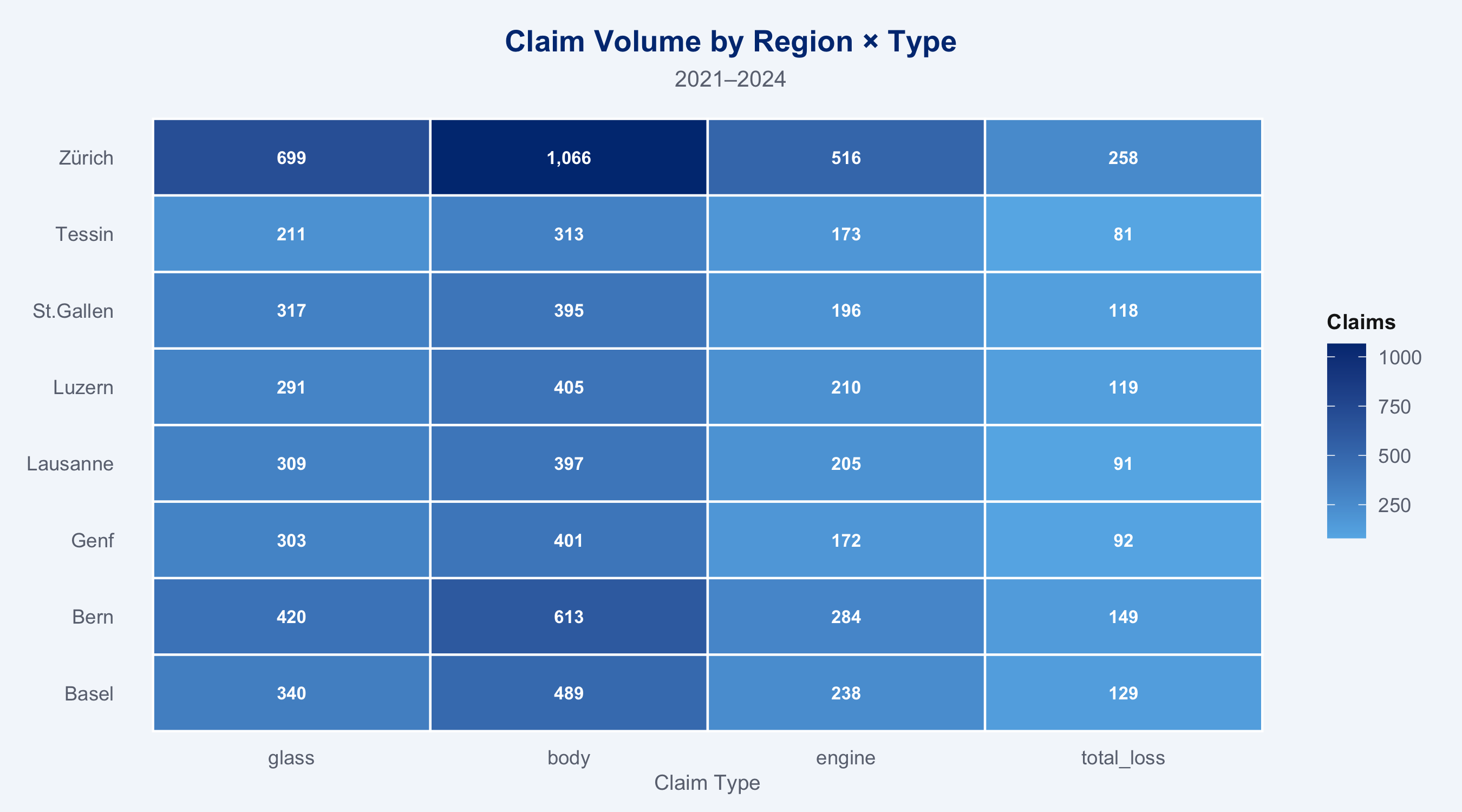
### Regional Volume Heatmap
```{r regional-volume}
#| fig-height: 5
regional_stats <- claims |>
  group_by(region) |>
  summarise(
    n_claims      = n(),
    pct_steered   = mean(steering_flag),
    avg_cost      = mean(repair_cost),
    .groups       = "drop"
  )

claims |>
  count(region, claim_type) |>
  ggplot(aes(x = claim_type, y = region, fill = n)) +
  geom_tile(colour = "white", linewidth = 0.5) +
  geom_text(aes(label = scales::comma(n)), size = 2.8, colour = "white", fontface = "bold") +
  scale_fill_gradient(
    low  = "#66B5E8",
    high = "#003781",
    name = "Claims"
  ) +
  labs(title    = "Claim Volume by Region × Type",
       subtitle = "2021–2024",
       x = "Claim Type", y = NULL) +
  theme_allianz(grid = "none")
```
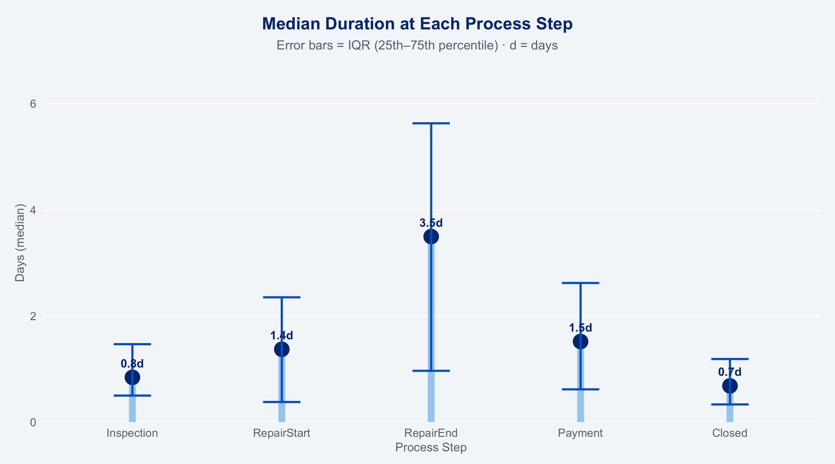
## Process Funnel Analysis
```{r process-funnel}
#| fig-height: 5
event_durations <- proc_events |>
  arrange(claim_id, timestamp) |>
  group_by(claim_id) |>
  mutate(
    prev_ts   = lag(timestamp),
    step_days = as.numeric(difftime(timestamp, prev_ts, units = "days"))
  ) |>
  ungroup() |>
  filter(!is.na(step_days), step_days >= 0) |>
  group_by(event_type) |>
  summarise(
    median_days = median(step_days),
    p25         = quantile(step_days, 0.25),
    p75         = quantile(step_days, 0.75),
    .groups     = "drop"
  ) |>
  mutate(event_type = factor(event_type,
                             levels = c("FNOL","Inspection","RepairStart",
                                        "RepairEnd","Payment","Closed")))

# Waterfall-style funnel using lollipop
ggplot(event_durations, aes(x = event_type, y = median_days)) +
  geom_segment(aes(xend = event_type, yend = 0),
               colour = "#66B5E8", linewidth = 2.5, alpha = 0.6) +
  geom_point(colour = "#003781", size = 5) +
  geom_errorbar(aes(ymin = p25, ymax = p75),
                colour = "#0066CC", width = 0.25, linewidth = 0.8) +
  geom_text(aes(label = sprintf("%.1fd", median_days)),
            vjust = -1.2, size = 3.2, colour = "#003781", fontface = "bold") +
  scale_y_continuous(expand = expansion(mult = c(0, 0.2))) +
  labs(title    = "Median Duration at Each Process Step",
       subtitle = "Error bars = IQR (25th–75th percentile) · d = days",
       x = "Process Step", y = "Days (median)") +
  theme_allianz(grid = "y")
```
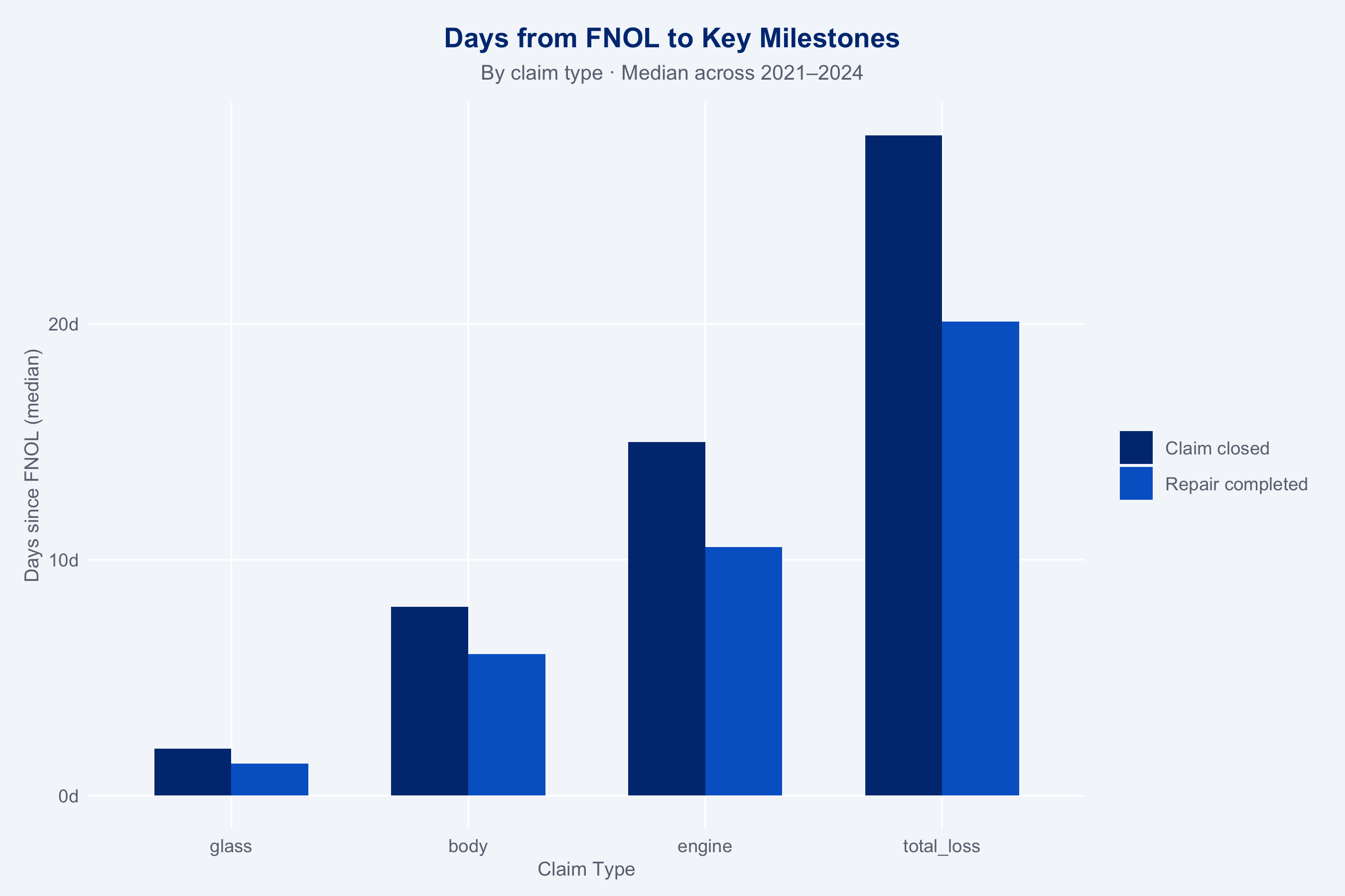
### Funnel by Claim Type
```{r funnel-by-type}
#| fig-height: 6
proc_with_type <- proc_events |>
  left_join(claims |> select(claim_id, claim_type, steering_flag), by = "claim_id")

proc_with_type |>
  arrange(claim_id, timestamp) |>
  group_by(claim_id, claim_type) |>
  mutate(
    days_since_fnol = as.numeric(difftime(timestamp,
                                          timestamp[event_type == "FNOL"],
                                          units = "days"))
  ) |>
  ungroup() |>
  filter(event_type %in% c("RepairEnd", "Closed")) |>
  group_by(claim_type, event_type) |>
  summarise(
    median_days = median(days_since_fnol, na.rm = TRUE),
    .groups     = "drop"
  ) |>
  ggplot(aes(x = claim_type, y = median_days, fill = event_type)) +
  geom_col(position = "dodge", width = 0.65) +
  scale_fill_manual(
    values = c(RepairEnd = "#0066CC", Closed = "#003781"),
    labels = c(RepairEnd = "Repair completed", Closed = "Claim closed"),
    name   = NULL
  ) +
  scale_y_continuous(labels = scales::number_format(suffix = "d")) +
  labs(title    = "Days from FNOL to Key Milestones",
       subtitle = "By claim type · Median across 2021–2024",
       x = "Claim Type", y = "Days since FNOL (median)") +
  theme_allianz()
```
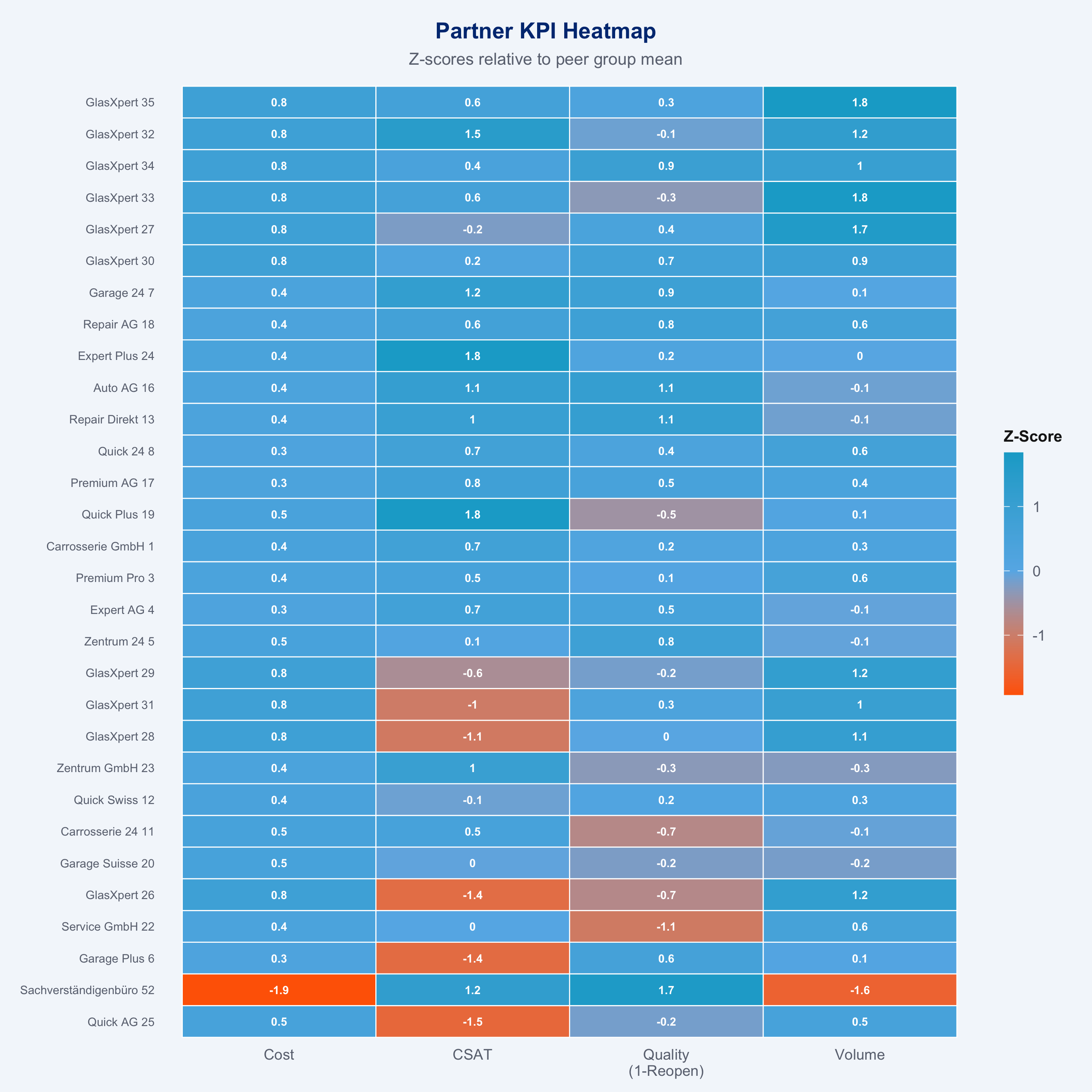
## KPI Heatmap
```{r kpi-heatmap}
#| fig-height: 9
kpis      <- compute_kpis(claims, partners)
kpis_cost <- cost_benchmark(kpis)
speed_df  <- speed_benchmark(claims, partners)

kpi_long <- kpis_cost |>
  left_join(speed_df, by = "partner_id") |>
  select(partner_id, name, type,
         cost    = cost_zscore,
         csat    = avg_csat,
         reopen  = reopen_rate,
         volume  = n_claims) |>
  # Standardise all KPIs to z-scores for comparability
  mutate(
    cost   = -cost,            # flip: lower cost = better (positive z)
    csat   = scale(csat)[,1],
    reopen = -scale(reopen)[,1],  # flip: lower reopen = better
    volume = scale(volume)[,1]
  ) |>
  pivot_longer(c(cost, csat, reopen, volume),
               names_to = "kpi", values_to = "z_score") |>
  mutate(kpi = factor(kpi,
                      levels = c("cost","csat","reopen","volume"),
                      labels = c("Cost","CSAT","Quality\n(1-Reopen)","Volume")))

# Show top-30 partners by avg z-score
top30 <- kpi_long |>
  group_by(partner_id, name) |>
  summarise(avg_z = mean(z_score, na.rm = TRUE), .groups = "drop") |>
  slice_max(avg_z, n = 30) |>
  pull(partner_id)

kpi_long |>
  filter(partner_id %in% top30) |>
  plot_kpi_heatmap()
```
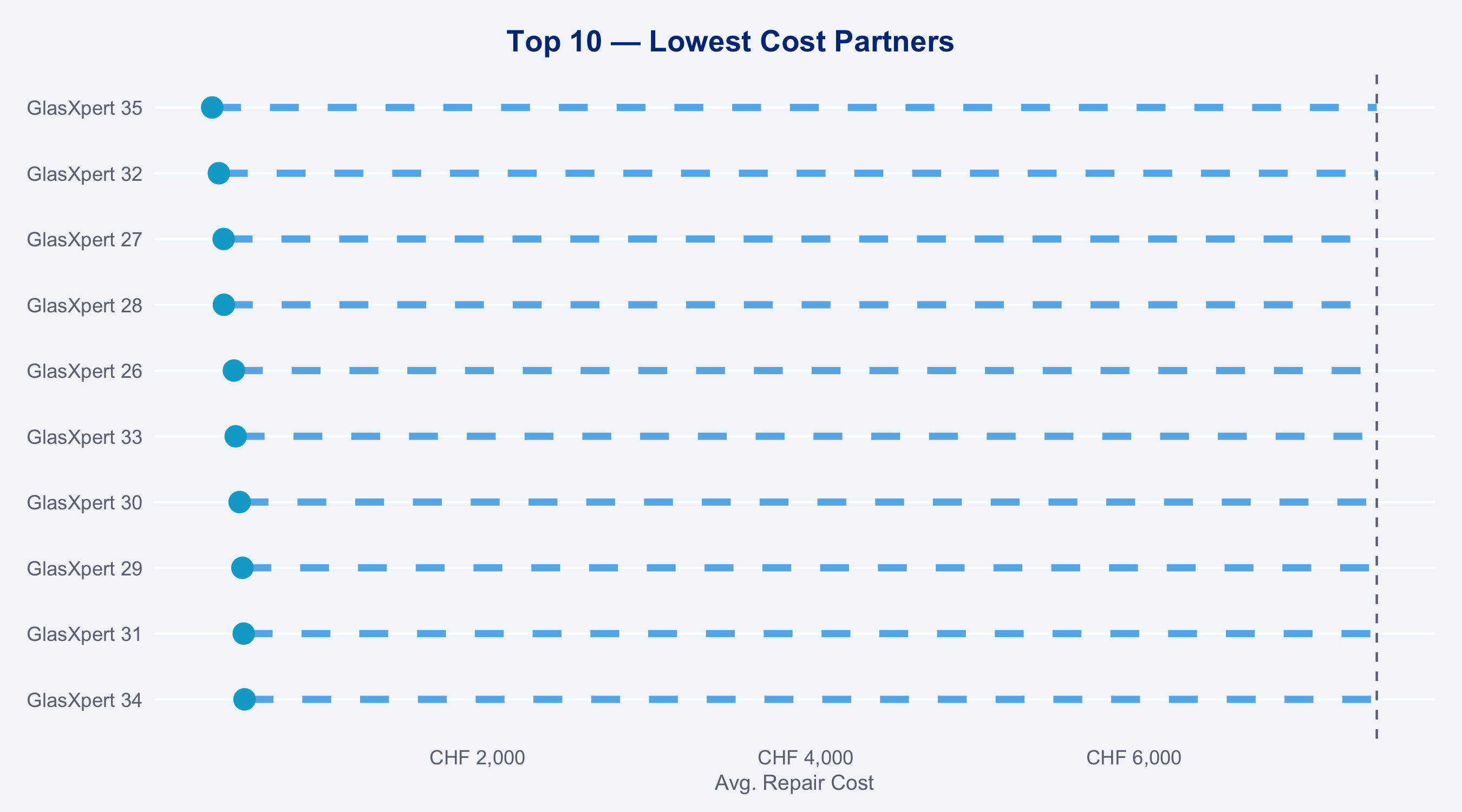
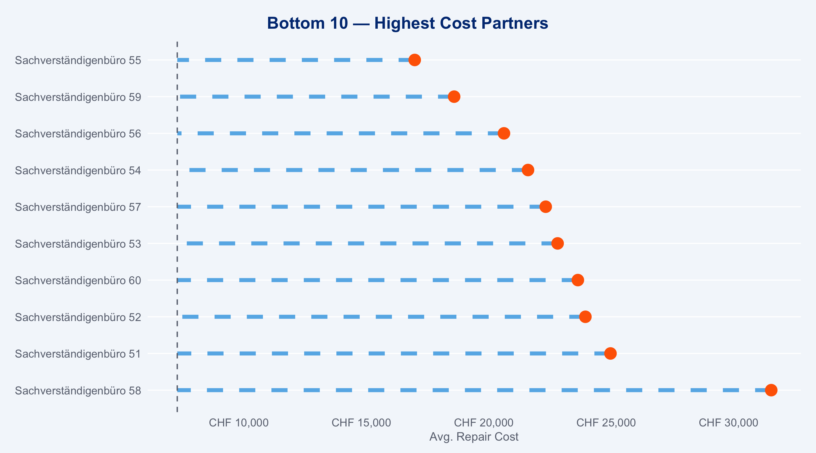
## Top / Bottom 10 Partners
```{r top-bottom}
#| fig-height: 5
#| layout-ncol: 2
kpis_ranked <- kpis_cost |>
  arrange(cost_zscore)

top10 <- kpis_ranked |>
  slice_head(n = 10) |>
  mutate(highlight = "Top 10 (lowest cost)")

bot10 <- kpis_ranked |>
  slice_tail(n = 10) |>
  mutate(highlight = "Bottom 10 (highest cost)")

plot_ranked <- function(df, title) {
  ggplot(df, aes(x = avg_cost, y = reorder(name, -avg_cost))) +
    geom_segment(aes(xend = mean(kpis$avg_cost), yend = reorder(name, -avg_cost)),
                 colour = "#66B5E8", linewidth = 1.5, linetype = "dashed") +
    geom_point(aes(colour = highlight), size = 4, show.legend = FALSE) +
    geom_vline(xintercept = mean(kpis$avg_cost),
               linetype   = "dashed", colour = "#6B7280", linewidth = 0.5) +
    scale_x_continuous(labels = scales::label_number(prefix = "CHF ", big.mark = ",")) +
    scale_colour_manual(values = c(
      "Top 10 (lowest cost)"    = "#00A9CE",
      "Bottom 10 (highest cost)" = "#FF6600"
    )) +
    labs(title = title, x = "Avg. Repair Cost", y = NULL) +
    theme_allianz(grid = "y")
}

plot_ranked(top10, "Top 10 — Lowest Cost Partners")
plot_ranked(bot10, "Bottom 10 — Highest Cost Partners")
```
```{r top10-table}
#| echo: false
kpis |>
arrange(avg_cost) |>
slice_head(n = 15) |>
select(name, type, region, n_claims, avg_cost, avg_duration, avg_csat, reopen_rate) |>
gt() |>
fmt_number(columns = avg_cost, decimals = 0, sep_mark = ",") |>
fmt_number(columns = avg_duration, decimals = 1) |>
fmt_number(columns = avg_csat, decimals = 1) |>
fmt_percent(columns = reopen_rate, decimals = 1) |>
data_color(columns = avg_cost,
palette = c("#003781", "#66B5E8"),
domain = range(kpis$avg_cost, na.rm = TRUE)) |>
data_color(columns = avg_csat,
palette = c("#FF6600", "#00A9CE"),
domain = c(6, 10)) |>
tab_header(title = "Top 15 Partners — Lowest Avg. Cost",
subtitle = "Inline bars show relative cost and duration") |>
tab_style(
style = cell_fill(color = "#003781"),
locations = cells_column_labels()
) |>
tab_style(
style = list(cell_text(color = "white", weight = "bold")),
locations = cells_column_labels()
) |>
tab_options(table.font.size = px(12))
```
## Steering Rate by Claim Type and Region
```{r steering-overview}
#| fig-height: 4
steering_summary <- claims |>
  group_by(claim_type, region) |>
  summarise(pct_steered = mean(steering_flag), .groups = "drop")

p_steer <- ggplot(steering_summary,
                   aes(x = region, y = pct_steered, fill = claim_type)) +
  geom_col(position = "dodge", width = 0.75) +
  scale_fill_manual(
    values = c(glass="#003781", body="#0066CC", engine="#00A9CE", total_loss="#FF6600"),
    name   = "Claim Type"
  ) +
  scale_y_continuous(labels = scales::percent, limits = c(0, 1)) +
  labs(title    = "Steering Rate by Claim Type × Region",
       subtitle = "Proportion of claims routed to network partner",
       x = NULL, y = "Steering Rate") +
  theme_allianz() +
  theme(axis.text.x = element_text(angle = 30, hjust = 1))

ggplotly(p_steer) |>
  layout(legend = list(orientation = "h", y = -0.2))
```