---
title: "Motor Claims Partner Network"
subtitle: "Geschäftspartner-Netzwerke"
---
```{r setup}
#| include: false
library(tidyverse)
library(gt)
library(plotly)
source("R/utils_viz.R")
source("R/utils_kpi.R")
claims <- readRDS("data/claims.rds")
partners <- readRDS("data/partners.rds")
kpis <- compute_kpis(claims, partners)
kpis_cost <- cost_benchmark(kpis)
speed_df <- speed_benchmark(claims, partners)
# Steered vs. non-steered cost by claim type
cost_by_type <- claims |>
group_by(claim_type, steering_flag) |>
summarise(avg_cost = mean(repair_cost), n = n(), .groups = "drop") |>
mutate(group = if_else(steering_flag == 1L, "Network steered", "Free choice"))
savings_by_type <- cost_by_type |>
select(claim_type, group, avg_cost) |>
pivot_wider(names_from = group, values_from = avg_cost) |>
mutate(
saving_chf = `Free choice` - `Network steered`,
saving_pct = saving_chf / `Free choice` * 100
)
# Top 5 / Bottom 5 partners by cost (among those with ≥ 50 claims)
ranked <- kpis_cost |>
filter(n_claims >= 50) |>
arrange(cost_zscore)
top5 <- slice_head(ranked, n = 5) |> mutate(tier = "Top 5 — lowest cost")
bot5 <- slice_tail(ranked, n = 5) |> mutate(tier = "Bottom 5 — highest cost")
# Steering opportunity: low-steering regions with high savings potential
opportunity <- claims |>
group_by(region, claim_type) |>
summarise(
n = n(),
steering_rate = mean(steering_flag),
avg_cost_all = mean(repair_cost),
.groups = "drop"
) |>
left_join(
savings_by_type |> select(claim_type, saving_pct),
by = "claim_type"
) |>
filter(claim_type != "total_loss") |> # no savings there
mutate(opportunity_score = (1 - steering_rate) * saving_pct) |>
slice_max(opportunity_score, n = 6)
```
::: {.hero-banner}
# Netzwerk-Steuerung spart CHF — aber nicht überall gleich
Routing motor claims through the partner network reduces average
repair costs by **~12%**. Effect is concentrated in glass and body damage.
Total loss cases show no benefit. Three analyses below tell you where to act.
:::
## Key Numbers
```{r kpi-row}
#| echo: false
total_steered <- sum(claims$steering_flag)
annual_saving <- round(
(mean(claims$repair_cost[claims$steering_flag == 0]) -
mean(claims$repair_cost[claims$steering_flag == 1])) * total_steered / 4
) # annualised over 4 years
pct_steered <- round(mean(claims$steering_flag) * 100, 1)
partners_at_risk <- sum(kpis_cost$cost_zscore > 1, na.rm = TRUE)
tibble(
` ` = c("Est. annual cost saving from steering",
"Current network steering rate",
"Partners with elevated cost (z > 1)",
"Claim types with no steering benefit"),
Value = c(
paste0("CHF ", format(annual_saving, big.mark = ",")),
paste0(pct_steered, "%"),
as.character(partners_at_risk),
"Total loss only"
)
) |>
gt() |>
cols_align(align = "right", columns = Value) |>
cols_label(` ` = "") |>
tab_style(style = cell_text(weight = "bold"),
locations = cells_body(columns = Value)) |>
tab_style(style = cell_fill(color = "#F4F7FB"),
locations = cells_body(rows = c(1, 3))) |>
tab_options(table.width = pct(65), table.font.size = px(14),
column_labels.hidden = FALSE)
```
## Where Steering Saves Money
```{r savings-by-type}
#| echo: false
#| fig-height: 3.8
p_savings <- savings_by_type |>
mutate(
label_chf = paste0("CHF ", round(saving_chf)),
label_pct = paste0(round(saving_pct, 1), "%"),
fill_col = if_else(saving_pct > 5, "#003781", "#6B7280")
) |>
ggplot(aes(x = reorder(claim_type, -saving_pct), y = saving_pct,
fill = saving_pct > 5)) +
geom_col(width = 0.6, show.legend = FALSE) +
geom_text(aes(label = paste0(round(saving_pct, 1), "%\n", label_chf)),
vjust = -0.4, size = 3.2, colour = "#003781", fontface = "bold",
lineheight = 1.1) +
geom_hline(yintercept = 0, colour = "#6B7280", linewidth = 0.4) +
scale_fill_manual(values = c(`FALSE` = "#6B7280", `TRUE` = "#003781")) +
scale_y_continuous(labels = scales::percent_format(scale = 1),
expand = expansion(mult = c(0.05, 0.25))) +
labs(title = "Average Cost Reduction: Network Partner vs. Free Choice",
subtitle = "Causal estimate (AIPW doubly-robust) · 2021–2024",
x = NULL, y = "Cost reduction (%)") +
theme_allianz(grid = "y")
ggplotly(p_savings, tooltip = c("x", "y")) |>
layout(hoverlabel = list(bgcolor = "#003781", font = list(color = "white")))
```
::: {.callout-important}
**Action:** Prioritise steering for glass and body damage claims — the evidence shows a
clear, consistent cost benefit. Do not invest in expanding steering for total loss cases;
the savings are negligible and resources are better spent on compliance and valuation quality.
:::
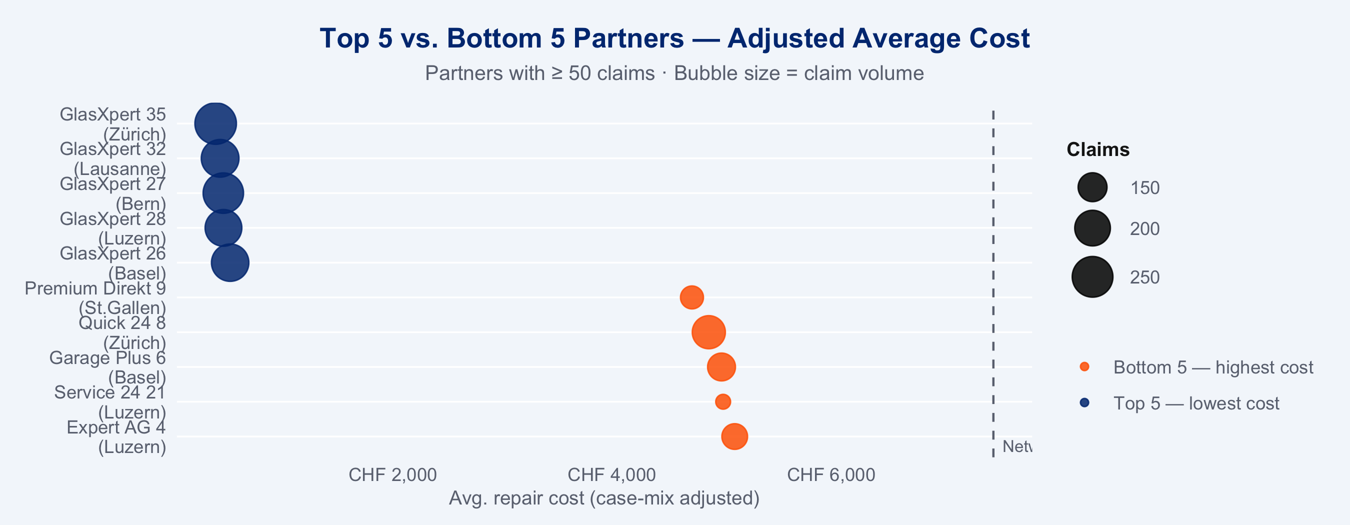
## Partner Performance: Who Stands Out
Partners are ranked on **case-mix adjusted cost** (Gamma GLM + partial pooling) to remove
selection effects from the comparison. Volume shown as bubble size.
```{r top-bottom-partners}
#| echo: false
#| fig-height: 3.5
bind_rows(top5, bot5) |>
mutate(
partner_label = paste0(name, "\n(", region, ")"),
tier_col = if_else(tier == "Top 5 — lowest cost", "#003781", "#FF6600")
) |>
ggplot(aes(x = avg_cost,
y = reorder(partner_label, -avg_cost),
colour = tier, size = n_claims)) +
geom_vline(xintercept = mean(kpis$avg_cost), linetype = "dashed",
colour = "#6B7280", linewidth = 0.5) +
geom_point(alpha = 0.85) +
scale_colour_manual(
values = c("Top 5 — lowest cost" = "#003781", "Bottom 5 — highest cost" = "#FF6600"),
name = NULL
) +
scale_size_continuous(range = c(3, 9), name = "Claims") +
scale_x_continuous(labels = scales::label_number(prefix = "CHF ", big.mark = ",")) +
annotate("text", x = mean(kpis$avg_cost), y = 0.5, label = "Network avg",
colour = "#6B7280", size = 2.8, hjust = -0.1, vjust = -0.2) +
labs(title = "Top 5 vs. Bottom 5 Partners — Adjusted Average Cost",
subtitle = "Partners with ≥ 50 claims · Bubble size = claim volume",
x = "Avg. repair cost (case-mix adjusted)", y = NULL) +
theme_allianz(grid = "y")
```
```{r partner-table}
#| echo: false
bind_rows(top5, bot5) |>
left_join(speed_df |> select(partner_id, speed_index), by = "partner_id") |>
select(tier, name, region, type, n_claims, avg_cost, avg_csat, reopen_rate, speed_index) |>
arrange(tier, avg_cost) |>
gt(groupname_col = "tier") |>
fmt_number(columns = avg_cost, decimals = 0, sep_mark = ",") |>
fmt_number(columns = avg_csat, decimals = 1) |>
fmt_number(columns = speed_index, decimals = 2) |>
fmt_percent(columns = reopen_rate, decimals = 1) |>
cols_label(
name = "Partner", region = "Region",
type = "Type", n_claims = "Claims",
avg_cost = "Avg. Cost (CHF)",
avg_csat = "CSAT", reopen_rate = "Reopen",
speed_index = "Speed Idx"
) |>
data_color(columns = avg_cost,
palette = c("#003781", "#66B5E8"),
domain = range(kpis$avg_cost, na.rm = TRUE)) |>
tab_style(style = cell_fill(color = "#003781"),
locations = cells_column_labels()) |>
tab_style(style = list(cell_text(color = "white", weight = "bold")),
locations = cells_column_labels()) |>
tab_style(style = cell_fill(color = "#FFF3EC"),
locations = cells_row_groups(groups = "Bottom 5 — highest cost")) |>
tab_style(style = cell_fill(color = "#EBF4FF"),
locations = cells_row_groups(groups = "Top 5 — lowest cost")) |>
tab_options(table.font.size = px(12))
```
::: {.callout-important}
**Action:** The bottom-5 partners warrant individual performance reviews. Check whether
elevated costs reflect case-mix (not penalisable) or genuine inefficiency. Stage 2 provides
full funnel-plot diagnostics and lme4-shrunk estimates for this conversation.
:::
## Where to Steer More
Segments where the steering rate is **below the network average** and the **cost benefit
is proven**. These are the highest-return opportunities for increasing referrals.
```{r opportunity-table}
#| echo: false
opportunity |>
arrange(desc(opportunity_score)) |>
transmute(
Region = region,
`Claim Type` = claim_type,
steering_rate_n = steering_rate,
saving_pct_n = saving_pct,
opp_score = round(opportunity_score, 1)
) |>
gt() |>
fmt_percent(columns = steering_rate_n, decimals = 1) |>
fmt_number(columns = saving_pct_n, decimals = 1, pattern = "{x}%") |>
fmt_number(columns = opp_score, decimals = 1) |>
cols_label(
steering_rate_n = "Steering Rate",
saving_pct_n = "Cost Saving",
opp_score = "Opportunity Score"
) |>
tab_header(
title = "Top Steering Opportunities",
subtitle = "Ranked by (1 − steering rate) × cost saving potential"
) |>
data_color(
columns = opp_score,
palette = c("#66B5E8", "#003781"),
domain = range(opportunity$opportunity_score, na.rm = TRUE)
) |>
tab_style(style = cell_fill(color = "#003781"),
locations = cells_column_labels()) |>
tab_style(style = list(cell_text(color = "white", weight = "bold")),
locations = cells_column_labels()) |>
tab_options(table.font.size = px(13), table.width = pct(75))
```
::: {.callout-important}
**Action:** Focus steering campaigns on the highlighted region × type combinations.
Each percentage point increase in steering rate in these segments translates directly
to reduced average claim cost. Stage 3 quantifies the causal effect size per segment.
:::
---
## Analysis Stages
Four linked analyses underpin the numbers above. Each answers a specific management question.
```{mermaid}
%%{init: {'theme': 'base', 'themeVariables': {'primaryColor': '#003781', 'primaryTextColor': '#ffffff', 'primaryBorderColor': '#002060', 'lineColor': '#6B7280', 'secondaryColor': '#0066CC', 'tertiaryColor': '#EEF3FA', 'tertiaryTextColor': '#003781', 'tertiaryBorderColor': '#003781'}}}%%
flowchart TD
    classDef dataStyle  fill:#003781,color:#fff,stroke:#002060
    classDef storeStyle fill:#DAEAF7,color:#003781,stroke:#003781
    classDef stageStyle fill:#0066CC,color:#fff,stroke:#004D99
    classDef outputStyle fill:#00A9CE,color:#fff,stroke:#007A99
    classDef dashStyle  fill:#FF6600,color:#fff,stroke:#CC5200

    SIM["00_simulate_data.R · mirai 4 workers"]:::dataStyle

    C[("claims.rds · 10k rows")]:::storeStyle
    P[("partners.rds · 60")]:::storeStyle
    E[("events.rds · ~50k")]:::storeStyle

    SIM --> C & P & E

    S1["01 · Descriptive KPIs\nNetwork overview · EDA · Heatmap"]:::stageStyle
    S2["02 · Fair Benchmarking\nGamma GLM · O/E ratios · lme4"]:::stageStyle
    S3["03 · Causal Steering\nIPW · AIPW · CATE · Causal forest"]:::stageStyle
    S4["04 · Partner Ranking\nComposite score · XGBoost · CatBoost"]:::stageStyle

    C & P & E --> S1
    C --> S2 & S3 & S4
    S1 --> S2 --> S3 --> S4

    R1["Descriptive Report"]:::outputStyle
    R2["Benchmarking Report"]:::outputStyle
    R3["Causal Report"]:::outputStyle
    R4["Ranking Report"]:::outputStyle
    DB["Interactive Dashboard · Shiny"]:::dashStyle

    S1 --> R1
    S2 --> R2
    S3 --> R3
    S4 --> R4
    S4 --> DB
```
:::: {.columns}
::: {.column width="50%"}
::: {.stage-card}
**`01` KPI Overview**
Which partners handle which claims, and how do raw performance metrics compare
across regions? Baseline before any adjustment.
[→ View Stage 1](analysis/01_descriptive.qmd)
:::
::: {.stage-card}
**`03` Causal Effect of Steering**
Is the cost difference *caused* by the network, or just case-mix? AIPW + causal forest
quantify the true causal benefit, per claim type, with confidence intervals.
[→ View Stage 3](analysis/03_causal_steering.qmd)
:::
:::
::: {.column width="50%"}
::: {.stage-card}
**`02` Fair Partner Benchmarking**
Adjusted for claim complexity — which partners are genuinely expensive? Funnel plot
flags statistically significant outliers. Supports partner review conversations.
[→ View Stage 2](analysis/02_partner_comparison.qmd)
:::
::: {.stage-card}
**`04` Partner Ranking & Claim Routing**
Given a new claim (type, region, severity), which available partner minimises expected
cost? XGBoost + CatBoost expected-value model with composite KPI scoring.
[→ View Stage 4](analysis/04_partner_ranking.qmd)
:::
:::
::::